Author: Dino Merotto, Jobs Group, World Bank.
Blog #2 in our series showed how the share of employment in services rises as countries get richer, and the share in agriculture falls. In this blog, we combine the pattern of GDP with that of employment.
Three simple charts show vividly how both the structure of GDP and employment changes as countries get richer. Agriculture’s share of GDP falls as countries get richer, whilst that of services rises. But the share of manufacturing in both GDP and employment first rises for middle income countries, then falls on average. What growth processes might lie behind these observed patterns?
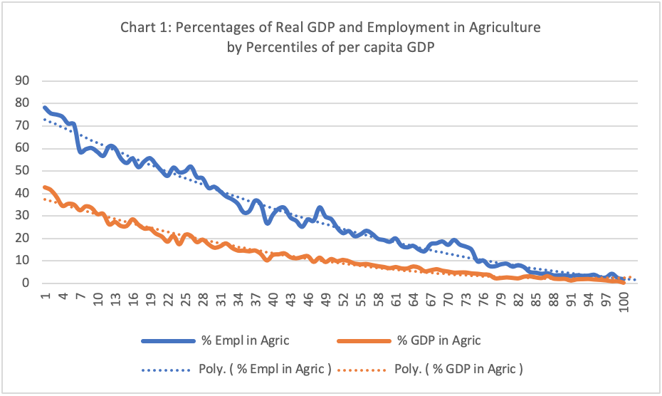
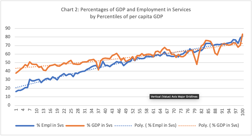
For each sector, the average shares of both GDP and employment, for countries at different points in the distribution, we show the GDP and employment shares by sector for all countries in all years. This is a pooled cross-section of annual country time-series data from 1991-2017, meaning that if there is more than one data point, a country can change percentiles over time. The gap between the two lines is the difference in shares of real GDP and employment by sector, so it shows differences in average levels of sector labor productivity across levels of per capita income.

For the bottom quintile of countries, chart 1 shows that the average share of employment in agriculture exceeds the average share of agriculture in GDP by a gap of about 30 percentage points. As GDP per capita rises, the agriculture gap narrows, declining almost linearly. So the share of workers in agriculture exceeds the share of agriculture in GDP in all countries, but most dramatically in Low Income Countries (LICs).
Agriculture still averages 53 percent of employment in the 20th percentile, but only 22 percent of GDP value added. In poorer countries, the gap between labor productivity in agricultural and non-agricultural sectors is high. At the 20th percentile, average productivity in services is 3.3 times that of agriculture, and productivity in industry is 10.5 times higher. These differentials mean that in the poorer countries there is a lot of scope to improve overall growth by increasing agricultural productivity (where more than half the jobs are), and in the process, by shifting labor into other, higher productivity sectors. We noted this in our Pathways report and will return to it in the next blog in this series.

Conversely, for countries in the bottom quintile, the average GDP share of services exceeds the employment share by 12.1 percentage points (chart 2).
The gap narrows as countries get richer. Indeed, by the 50th percentile, the shares of both employment in services (50.8 percent on average), and GDP in services (52.8 percent on average), converge at around a half.
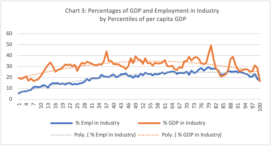
Chart 3 speaks to well-known paradigms for economic development, such as Rostow’s `Stages of Growth’, Galor and Weil’s Population, Technology, and Growth and Rodrik’s ‘Premature de-industrialization’. It shows two related things:
- First, the share of industry (the data includes extractives) in employment and GDP first rises and then falls across percentiles of per capita GDP.
- Second, the average share of industry in GDP exceeds the average share of employment across all income groups.

Of course, the share of industry and extractives in GDP is strongly influenced by whether the country is resource rich. But, as we showed in blog #2, unlike agriculture and services, industrial employment rarely exceeds 30 percent of total employment.
Though the gap between output and employment in industry declines in richer countries, it is still 5 percentage points in the high-income countries (HICs). In the lowest quintile, the share of employment in industry is just 11 percent on average, whereas industry’s share of real GDP value added is 23 percent (a gap of 12 percentage points). Between the 20th and 40th percentiles, employment averages 18 percent and the industry share averages 33 percent (a gap of 15). In the middle percentile, employment averages 26 percent and industry 34 percent of GDP (a gap of 9).
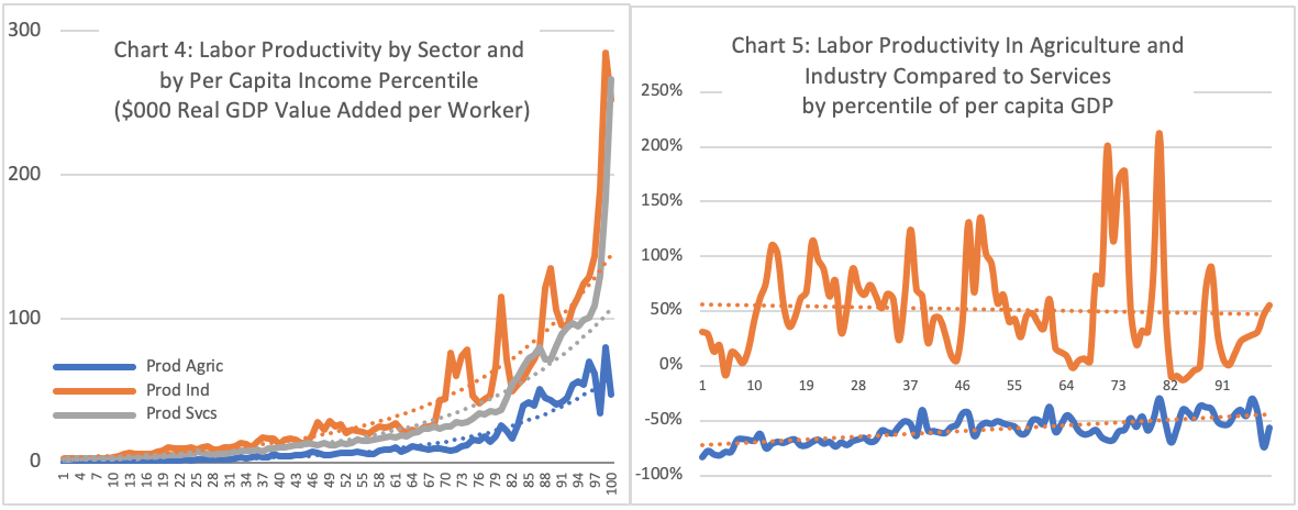
Chart 4 shows how total labor productivity varies as countries get richer. Levels of average labor productivity in all sectors seem to rise fast with per capita income (although the use of percentiles for the x-axis compresses the trends at high levels of per capita income). Industrial productivity is generally higher than services on average, but with quite dramatic fluctuations driven by resource rich countries. (Chart 5 shows the ratio of labor productivity in industry and agriculture to that of services).

Models of structural change tend to assume four inter-related related growth forces shape the process of development. These inter-related forces explain the patterns of structural change observed in charts 1-5. They are:
- resource (re)allocation in response to systematic change in the patterns of consumption and trade as incomes rise (in line with Engels Law and comparative advantage);
- accumulation: the increased deployment in production of both physical and human capital resources, at rates higher than the growth of the labor force;
- demographic change from demographic transition, urbanization and internal migration
- technology adoption arising from and giving rise to; (i) global integration, and (ii) different combinations of human and physical capital in production; and resulting in different growth rates in labor productivity between and within sectors in an economy.
In future blogs, we will combine data analysis with economic theory around these forces to identify priorities for jobs strategies for different countries at different stages of structural change.


